Work Different:
Powerful PPT Designing Skills
by Shenoj Kuruvilla
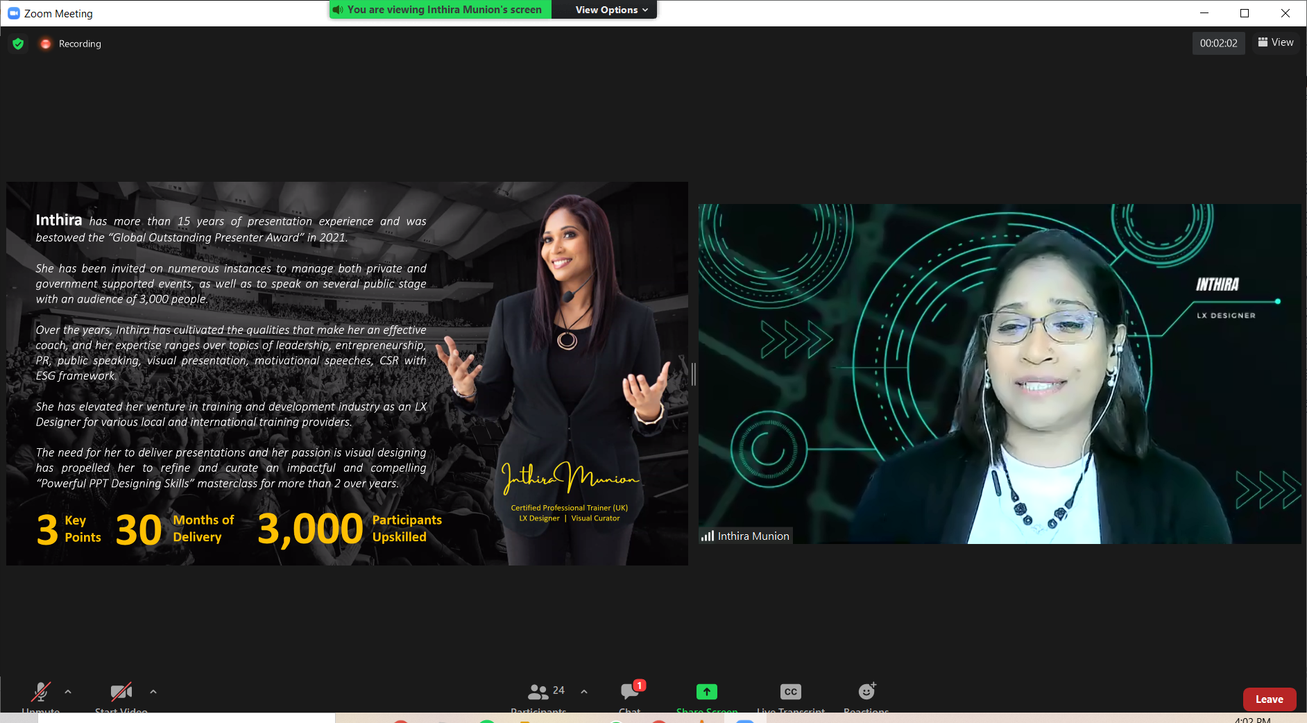
On 11th March 2022, BAC Education Group organised its usual Work Different seminar for its staff. This week, the topic was “Powerful PPT Designing Skills.” The speaker was Ms. Inthira Munion who currently lends her talents to Leadpedia as an LX Designer and a youth transformational coach, as well as to Agathians Shelter as a CSR Strategist.
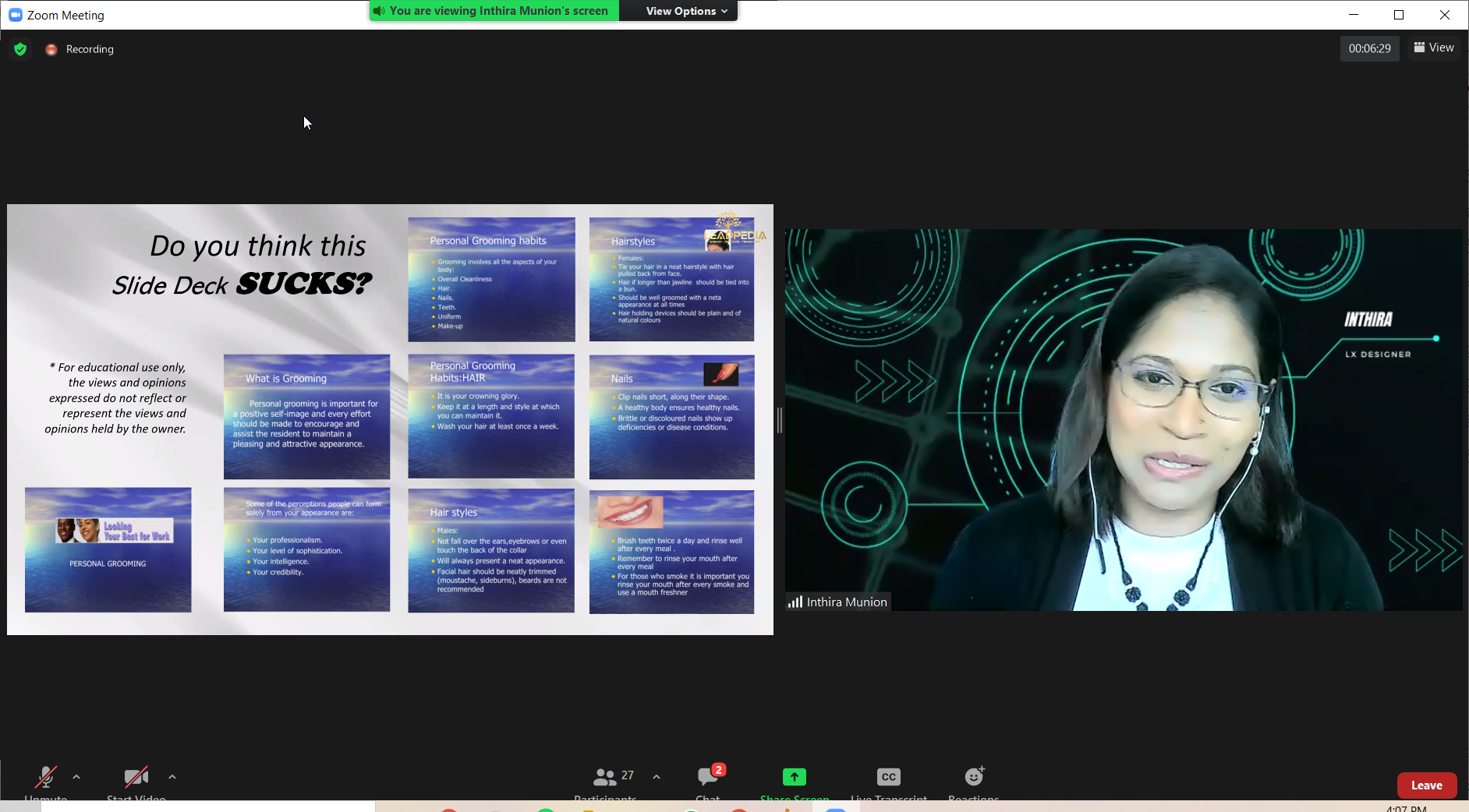
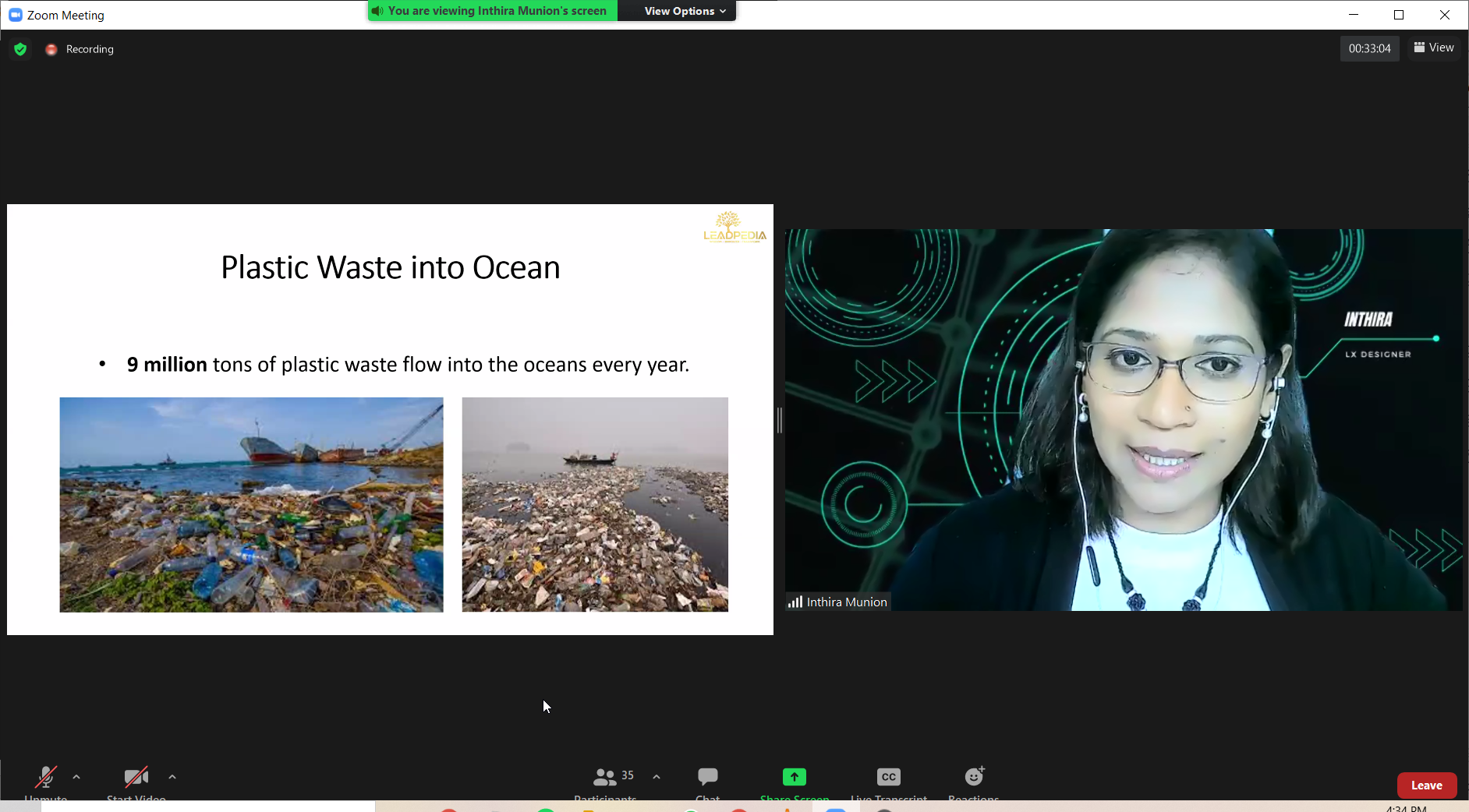
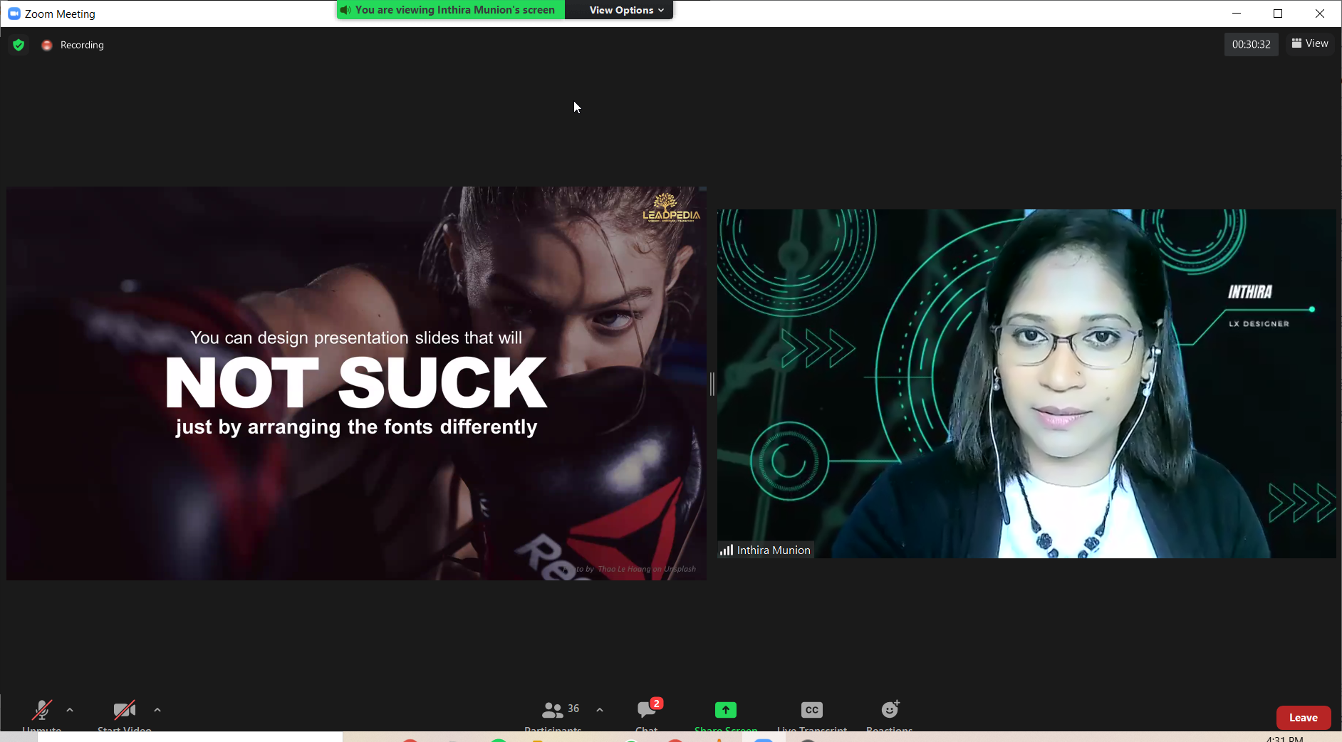
From the start of the webinar, Ms. Inthira firmly stated that her slides were all created on PowerPoint. She started off by indicating that there was a reason we chose everything on PowerPoint, as it all correlates with human psychology. She then shared a quote from Guy Kawasaki, saying “95% of presentations suck,” as during a presentation would usually be when someone brings out their phone. Additionally, according to a Harvard study in 2019, PowerPoint is actually worse than useless. Ms. Inthira then proved her point by presenting examples of bad slide decks from major companies, showing that even top notch companies make such a mistake.
After firmly cementing our belief that PowerPoint is not used well, Ms. Inthira then asked a question: Do you use it for your own convenience? With varying answers, Ms. Inthira explained the three reasons why PowerPoint is not used effectively. For convenience sake, lack of skill in creating PowerPoints and uncaring attitude towards the whole matter. According to Ms. Inthira, your deliverables (in this case, a PowerPoint presentation) should reflect the work you do.
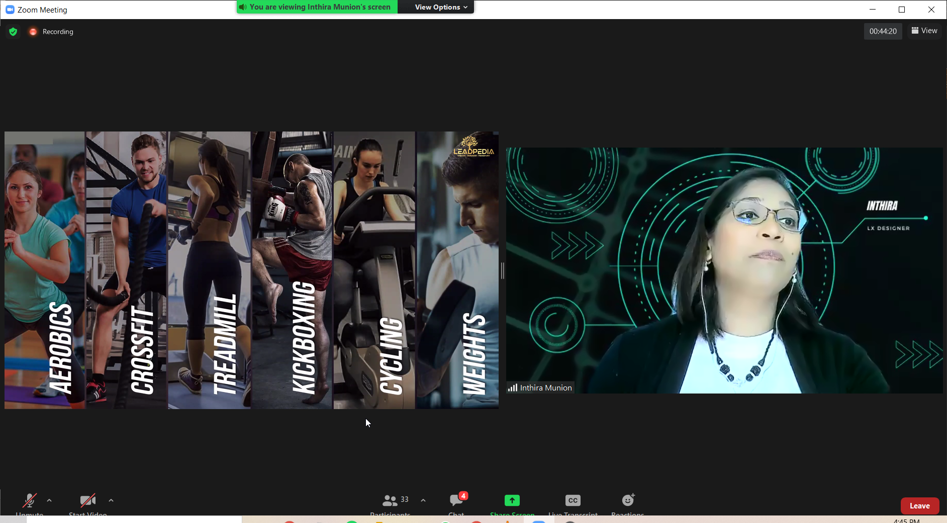
From there, Ms. Inthira started introducing concepts in which to make your slide deck more engaging. She said that times have changed, and as such, people generally only pay attention to what looks and sounds good. One example was billboards. If they are meant to capture one’s attention, why not design your slides that way? Another example was blockbuster movies. Ms. Inthira shared that there are members of her team whose job scope is just watching blockbuster movies and extracting the eye-catching visual elements from them to create appealing slide decks. She emphasised that slides should be effective, compelling, and memorable.
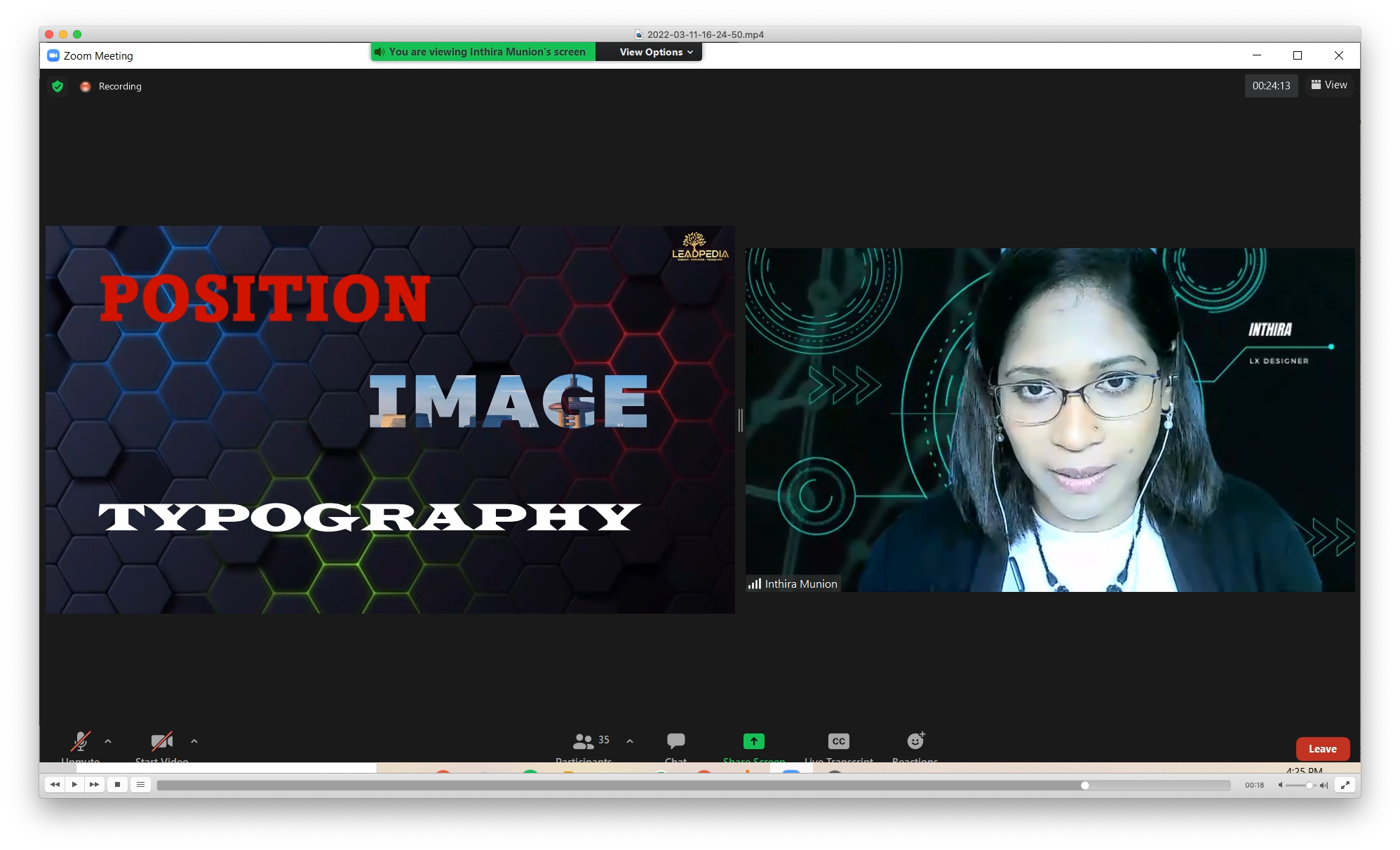
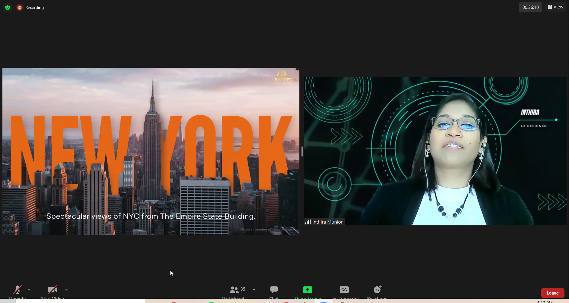
Next, Ms. Inthira shared about narrative slide design. There are 3 key points to take note of: position, image and typography. Ms. Inthira called this the “PIT” technique. She went on to explain the significance of each point. Position is about using space effectively, and can create emphasis and hierarchy. Image and typography have distinct uses but should be seen as equals in their role on the slide. She then shared some practical tips with examples to help enhance the slides using the “PIT” technique:
1. Use a moving image in your slide to capture attention
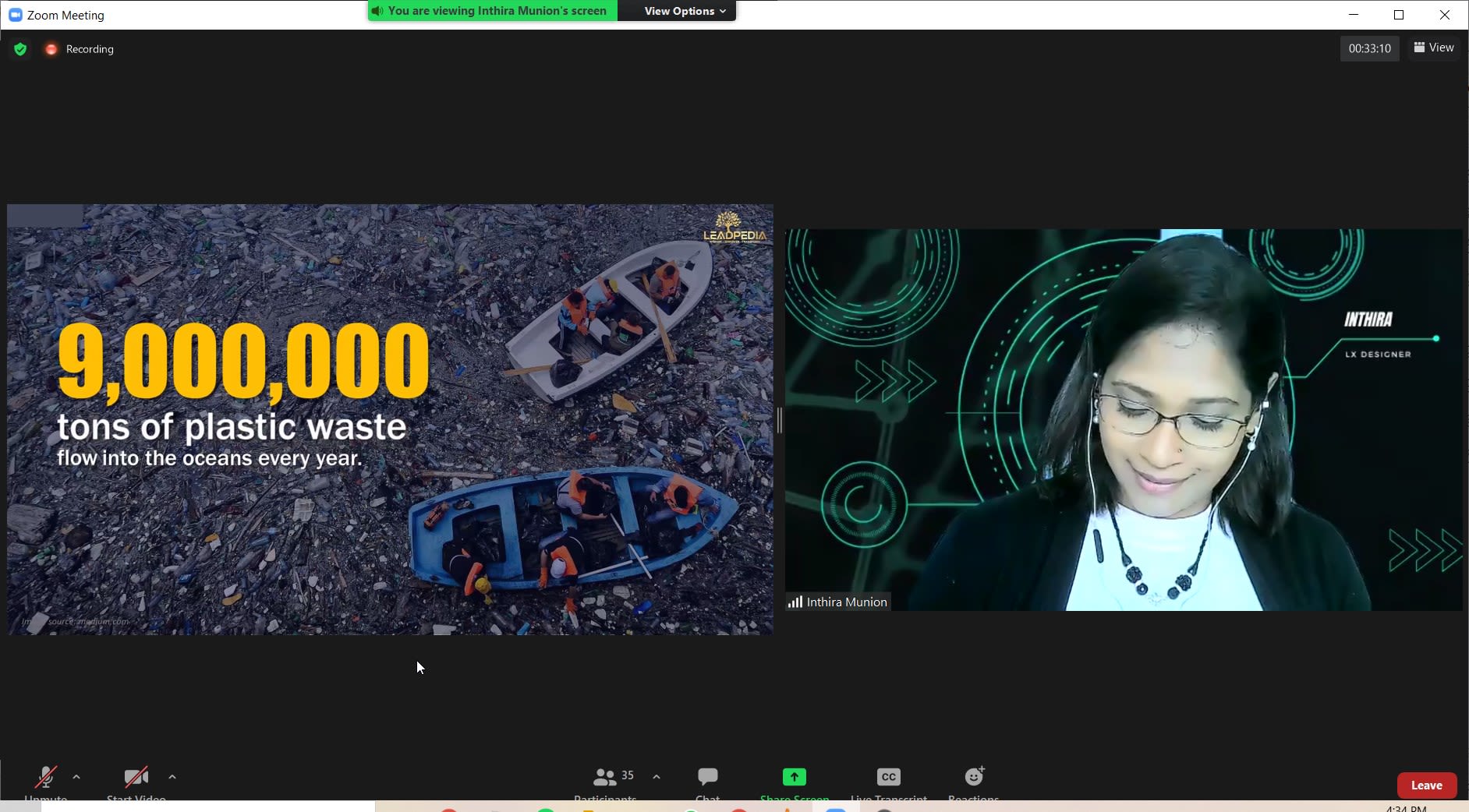
2. Always use HD images
3. Use numbers instead of typing out the value in words
4. Create a 3D effect by using a layered slide
5. Visual data telling can be made more dynamic with the “PIT” technique
6. Do not use too many colours at once
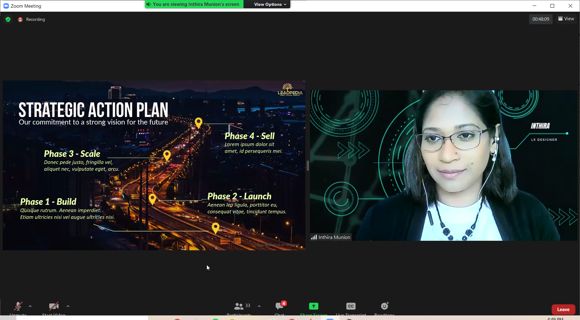
7. Avoid bullet points
With all this being said, Ms. Inthira explained that your target audience is very important, and sometimes a simpler slide will allow the audience to process the information better, so a balance is always necessary.
All in all, Ms. Inthira’s webinar was extremely informative and useful for BAC employees, especially lecturers who have to conduct presentations for every class. These tips and tricks will allow the staff to streamline their presentations into something exemplary.

